Google analysis shows that an average travel shopper visits 22 websites before finally booking a trip.
On an average, more than 95% traffic coming on travel packages and hotel websites leave without making a purchase. You may ask why?
Travel booking is one of the complex online business – thanks to the multiple forms, massive personalisation, complicated checkout process and complex search parameters.
The average conversion rate, i.e. percentage of visitors turning into customers, is just 4%, which is far below Professional or Financial Services.
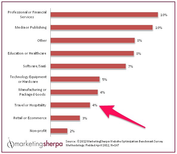
But, you can always improve this number by optimising your website so that more visitors turn into paying customers.
Below are 5 actionable tips that you can use on your website to turn visitors into customers.
1. Reviews are the gold mines
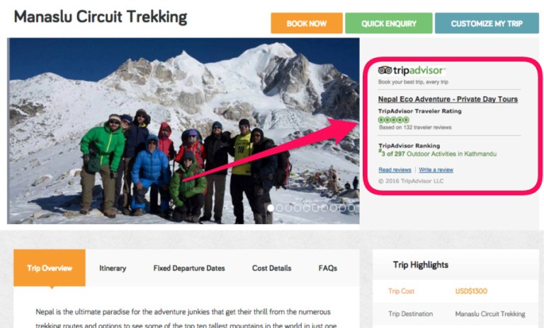
Reviews are great for the social proof and trustworthiness of any business. But, if you are in the travel business, this is a must!
Below are some eyes opening facts about reviews in the online travel business.
- Around 93% of international travellers say that their booking decisions are impacted by online reviews.
- As many as 70% of travellers look at around 20 reviews during trip planning
- Around 49% of travellers won’t book a hotel without reviews.
TripAdvisor is the leading travel reviews website in the world. The Consumer Trend survey shows that the influence of TripAdvisor is growing in the travel decision making and impacts tourism industry of all countries.
If your travel business is not listed on TripAdvisor, make a point to list your business on TripAdvisor. And, get reviews from your customers regularly.
A word of caution though. Don’t make fake reviews because they are clearly identifiable.
2. Make it Clear Why You Rock!
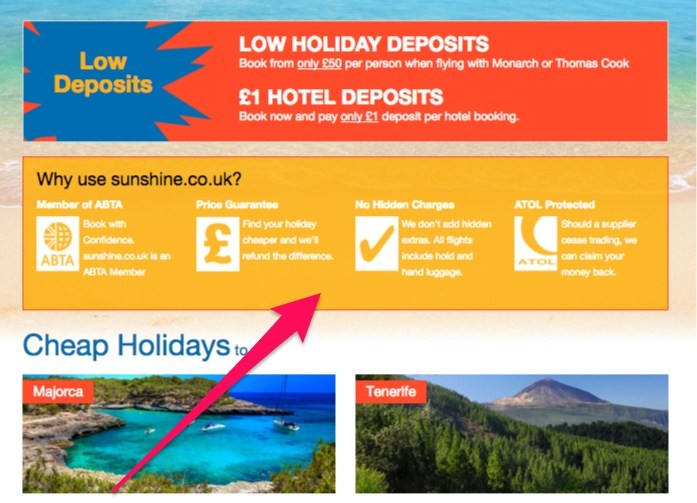
There are thousands, if not more, online travel websites that are doing the same business as you are.
But, what makes you different? What are your Unique Selling Points (USP)? What are your main benefits?
When a travel company clearly communicated its main benefits and made some changes on the site, they were able to make an extra 14 million a year.
Your company main benefits shouldn’t be based just on vague opinions, but on verified customer research.
- Do you have great reviews on TripAdvisor?
- Do you offer lower price compared to others?
- Are there no hidden costs?
- Do you provide excellent service?
- Are your guides fluent in English or other languages?
- Are you in business for more than a decade?
You know your business better than others. List down things that you think are your company benefits.
But also reach out to your customers and ask them what they liked about your company and how they would describe your company to a friend.
This should give you insight about your company’s USB.
Look at all the data and distill it into the main benefits. Then display them on the most visible place on your website.
3. Leave no room for ambiguity
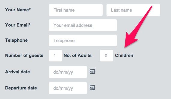
Any information that is vague and could be interpreted in different ways is a potential booking barrier.
For example, when you ask visitors for their age, you might have them three options to choose from – kid, adult and elderly.
You might think that you have communicated clearly, but how about someone who is 17 years old? She definitely doesn’t think herself as a kid and she is not legally an adult?
How about someone who is 55 – an adult or elderly?
There is always some room for confusions.
One extra data field cost Expedia $12 Million. You ask how?
Expedia could see from their analytic software that many customers were choosing a hotel, clicking the booking buttons but weren’t completing the booking. Why?
After analysis they found that there was an optional field on the booking form called ‘Company’. People were confused by it and they thought that Expedia was asking for their bank name rather than the company they worked for.
Having entered the bank name, they entered their bank address – not home – in the address field. This caused credit card transactions to fail because the address entered was not cardholder’s address.
When Expedia removed the optional company field, they saw $12 Mission yearly profit boost!
4. Make your website work smoothly in mobile devices
Mobiquity did a survey on 1000 independent people in which the people were asked to plan and book travel trips using smartphones and tablets. The survey revealed that 35% of travellers who doesn’t have satisfactory mobile experience with an online travel website won’t book again.
If your website doesn’t work seamlessly across all devices, you might be pissing off a lot of potential customers and loosing money and reputations.
Take a look at the data in the image below:
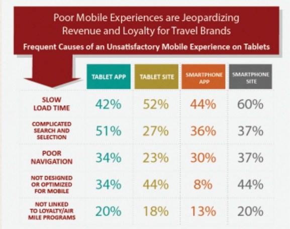
Another reason you should have a mobile friend website is because Google gives ranking boost to mobile friend websites.
Invest in a responsive design so that visitors of your website have a smooth experience across all the devices.
5. Make your website look trustworthy
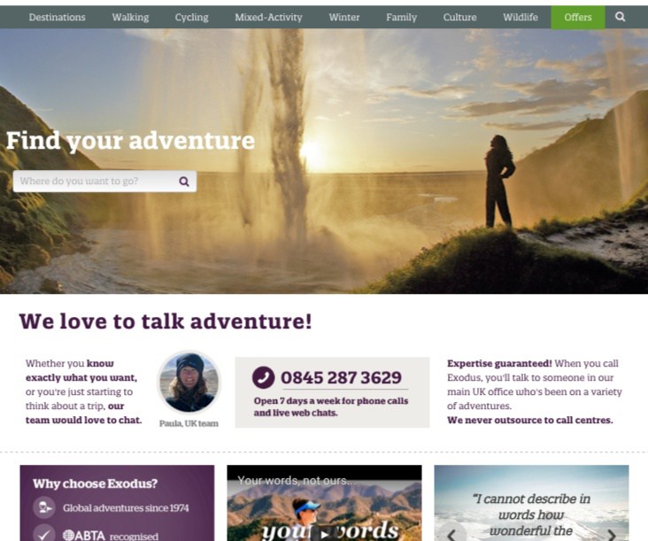
Men are judged by the appearance of their shoes. And, the authenticity of your website is judged by the appearance of your website.
Too many rotating images, misspelling, bad grammar, unrecognised security logos, clumsy layout, shoddy design and no trust badges are all sign of a possible fake business.
Online frauds are out there and visitors are more cautious about revealing their personal and credit card information online.
Therefore, it is extremely important that you show trust and authenticity via your website.
A travel agency, Planetamex, didn’t come across credible because of dated logos and award seals on its website. When they ran a split test and replaced the home page banner with one built with credibility makers of the AMEX brand, their phone call conversions increased by 48%.
Use testimonial, customer reviews (TripAdvisors?), media coverage, photos with the customers and privacy policies to win the visitors trusts.
When you ask for credit card information, display a security seal along with it.
Conclusions
You have seen that the 5 tips can increase travel website booking. If you have a travel website, make it a point to implement the above five tips.
If you are just starting with the optimisation process, look at the maximum drop off page in your analytics. This would be a good starting point to fix the leaking conversion.
Should you have any questions about website optimisation or mobile responsive design, please drop a message in the comment section below or contact us page.
